
Content rows are the building blocks for pages and other content types. They allow you to add and arrange content in various formats on a page/node. You can rearrange and add as many as you like until you have the desired layout.
Below you will find instructions for creating content rows and the types of rows available.
How to add a content row
To add a content row to a page or node, log in to Drupal and either add a new page or content type, or navigate to the existing page or node you want to edit. Once in the editing interface, follow these steps:
Scroll down to the "Content row(s)" section and click "add content row'
Image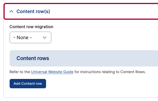
- Enter a "Row title" if applicable. This will show as a heading 2 for the section and is optional.
Enter "Row content" or description if needed.
Image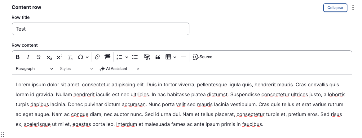
- Under the "Row component" section, select the type you would like to use for your content.
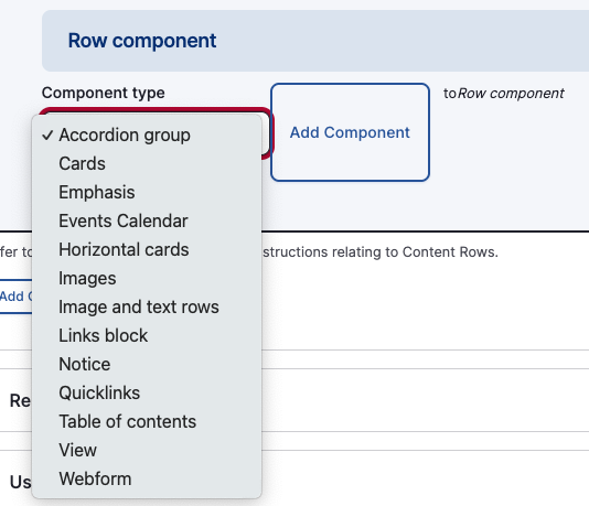
- Once you've selected your row component, fill out the fields for that component.
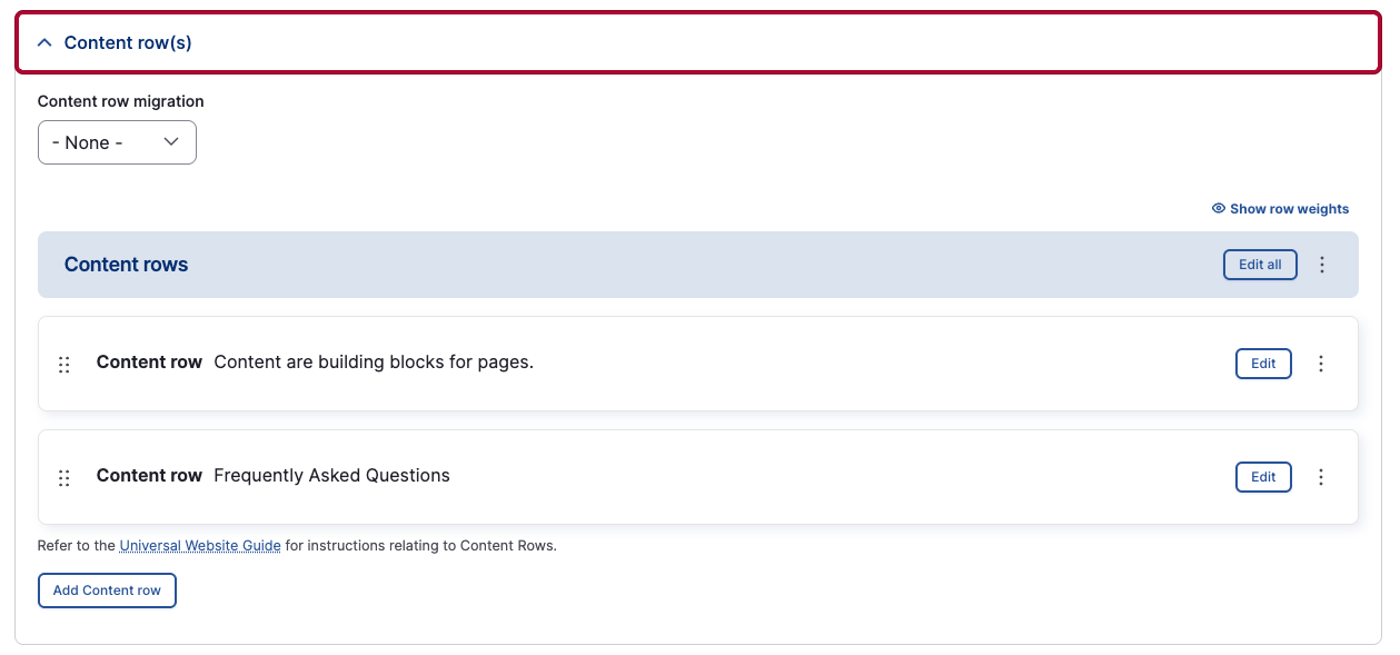
- Continue to add more content rows to your page/node as needed by clicking the "Add Content row" button. Once you've added multiple content rows, you can use the six dots on the left of the content row to drag and drop rows to rearrange the order as needed. Make sure to save your page/node once you're finished editing.
Content
Content rows are the base standard row type. This content row includes all the key elements of a word processor such as headings, block quotes, tables, media, and links. This is sometimes referred to as a What You See Is What You Get (WYSIWYG) editor.
Heading 2
Heading 3
Heading 4
Heading 5
heading 6
On This Page
On This Page provides an overview of the content on a page, along with links that take users to each section.
Cards

Horizontal cards
Horizontal card #1
Lorem ipsum dolor sit amet, consectetur adipiscing elit. Integer laoreet vestibulum mollis. Sed vitae urna sollicitudin, pulvinar diam vel, facilisis libero. Pellentesque at posuere metus, in aliquam mi. Duis neque libero, pulvinar vitae imperdiet a, temp
Horizontal card #2
Integer laoreet vestibulum mollis. Sed vitae urna sollicitudin, pulvinar diam vel, facilisis libero. Pellentesque at posuere metus, in aliquam mi. Duis neque libero, pulvinar vitae imperdiet a, temp
Horizontal card #3
Pellentesque at posuere metus, in aliquam mi. Duis neque libero, pulvinar vitae imperdiet a, tempor non sapien. Cras ex felis, tempus non mi at, consequat ultricies velit. Aenean sed ante id ante eleifend tincidunt. Aenean lobortis rutrum semper. Donec ru
Image and text rows
Lorem ipsum dolor sit amet, consectetur adipiscing elit. Integer laoreet vestibulum mollis. Sed vitae urna sollicitudin, pulvinar diam vel, facilisis libero. Pellentesque at posuere metus, in aliquam mi. Duis neque libero, pulvinar vitae imperdiet a, tempor non sapien. Cras ex felis, tempus non mi at, consequat ultricies velit. Aenean sed ante id ante eleifend tincidunt.

Notice
Notice #1
Curabitur molestie eu felis et pharetra. Etiam commodo velit vitae diam convallis, sit amet elementum elit venenatis. Curabitur vel nisi ut purus lacinia ultricies blandit at justo. Morbi ut metus vitae ante pharetra ullamcorper. Fusce interdum ex non augue ultrices porta in ut mi. Fusce molestie efficitur tincidunt.